The Portfolio of Derek Brooks

Projects

Here's a rough list of 100 projects that I've worked on over the past 23 years. Some projects have been omitted due to confidentiality concerns.

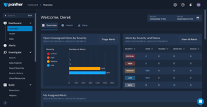
Panther Console

Screenshot of Panther Console
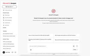
Panther is a cloud-based SIEM (Security information and event management) cybersecurity company that I work for. We ingest logs from various sources and help security teams identify threats based on homegrown and custom detection rules. The back-end is a mix of golang and python deployed to a largely serverless infrastructure and makes extensive uses of queues, document-based data stores, etc. The front-end is react and typescript and interfaces with the backend via GraphQL. My primary focus has been on our detection and alerting interfaces, as well as integrating with third party services. Within these realms, I work on the full stack of the Panther application - from architecting features, defining graphql services, and implementing backend logic in golang to building out front-end components.

Galactic Crypto Card

Galactic was a startup that was developing a product that would allow workers who were paid in cryptocurrency to easily spend their earnings via a debit card that linked to their wallet. I contracted with them to mentor/pair program with new frontend developers on building out the new user registration flows and account management pieces of the product. The company was unfortunately shut down before the product was launched.

Roboflow Python SDK

Screenshot of Roboflow Python SDK
Roboflow is a computer vision startup founded by a friend in my city. I spent a short time contracting with them to build APIs and work on their Python SDK. Aside from implementing some image classification and segmentation features, I was also about to containerize the Python package, DRY up a bunch of code, and improve their test coverage. I really enjoyed getting to work with this company and play with ML, computer vision, and annotating images with masks, overlays, etc.

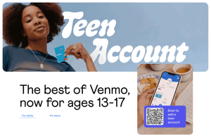
Venmo Teen Card

Screenshot of Venmo Teen Card
The Teen Card is one of the last initiatives that I worked on before leaving PayPal/Venmo. This project was particularly challenging due to all of the restrictions and red tape that come along with building financial software for minors. This was the first time that we needed to introduce a new type of "delegate account," which would allow the teen to log in, be restricted from certain features, and also be managed by / linked to their parent's Venmo account. I spent most of my time on this project working with PayPal architects to design the systems to manage the delegate accounts, allow them to act as entities on our existing Venmo models, and also designed interfaces between PayPal/Venmo back-ends and our mobile app.

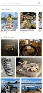
derek.broox.com

Screenshot of derek.broox.com
derek.broox.com is my general home page, online scrapbook, and development playground. Its primary purpose is to catalog my life and allow me to play with various APIs and web development technologies. It serves up thousands of photos, check-ins, microblogs, blogs, maps, videos, and various other data from my life. Since 2001, it has been a constantly evolving web application.

v8 - latest version

This is the first version of my site that I completely rebuilt in a new language and platform. I moved the entire site from a containerized LAMP stack to a server-side-rendered (SSR) Nuxt.js application that relies completely on the Broox API to power its content. I chose Nuxt and SSR in order to keep my SEO and open graph / social sharing meta tags intact while still providing a speedy, asynchronous client-side browsing experience.

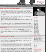
Broox Integration

Broox Integration is a containerized set of scheduled and manually run Python scripts that I use to manage the data that powers the Broox API. Its primary purpose is to sync data with various social networks (Flickr, Twitter, Foursquare), but I also use it for things like moving photo assets to cloud storage providers or running batch operations on my local data. All third party API response data that I fetch is cached in a Mongo DB and then manipulated to store only the relevant data in the MySQL DB that powers the Broox API.

Broox API

Screenshot of Broox API
This is a RESTful API to surface all of my personal data like blogs, microblogs, photos, geodata, etc. It currently powers derek.broox.com and photos.broox.com.

v2 - latest version

After growing a little tired of Node, Express and Sequelize, I decided to rebuild my personal API using Python, Flask, and SQLAlchemy. The end product felt much cleaner and allowed me move a lot faster when iterating on new features.

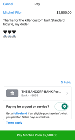
Venmo Gift Wrapping

Screenshot of Venmo Gift Wrapping
Venmo Gift Wrapping provided a fun way for users to send payments with animated greeting cards to friends and family. This was a shotgun project with a tight deadline that I co-led, architected, and developed alongside a small team of engineers. We leveraged AWS lambdas and DynamoDB to power the storefront for the different designs and proxied all mobile requests through the Venmo Platform API. The product shipped on time and launched with a beautiful short film produced by Wong Fu Productions.

Venmo Purchase Protection

Screenshot of Venmo Purchase Protection
Purchase Protection provided a simple toggle button for Venmo consumers to specify whether or not they're paying for goods or services while sending a payment. When a payment is sent for goods and services, the seller would be charged a small fee and the payment would automatically be covered under Venmo's Purchase Protection Program. If something went awry with the transaction, both the buyer and seller could be covered and reimbursed. I was the lead architect for this feature and designed the APIs, data storage and fee collection solutions.

Venmo Cashback to Crypto

Screenshot of Venmo Cashback to Crypto
The Venmo Credit Card offers up to 3% cash back on a user's top expenditures. After Venmo launched the ability for users to buy and hold cryptocurrency in their accounts, we decided to allow Credit Card users to automatically turn their cash back rewards into the cryptocurrency of their choice. I co-led the effort and worked with a small team of engineers to architect and build the new functionality that made heavy use of Cloudevents, PayPal's crypto APIs, and internal Venmo services to get the job done.

Venmo Credit Card

Screenshot of Venmo Credit Card
Amidst the start of the COVID-19 pandemic, the Chicago Venmo team was tasked with launching one of our most ambitious products. We worked closely with PayPal Credit, Synchrony Bank, and several internal Venmo teams to launch a branded Venmo Credit Card product in just 10 months time. I served as a tech lead and cross-company liaison to help architect and lead the development of the Credit Card servicing portion of the product. This included the data syncing, data structures, and API design to power the interfaces that a user sees when viewing or managing any information about their credit card in the Venmo Application. Later, I worked with a small team to add Cryptocurrency Reward functionality and also led the effort to get the Credit Card service's codebase upgraded to a more modern version of Python.

Venmo Payouts

Screenshot of Venmo Payouts
Venmo Payouts is a product that I got to build as a proof of concept and then turn into a full-fledged product alongside a small team of developers. The initial proof of concept was a shotgun hack to power a couple marketing campaigns that would allow merchants like Chipotle to send small payments to users in an effort to get them to buy burritos. After the success of the pilot campaigns, I acted as a tech lead and liaison between the Venmo team and PayPal MassPay teams to architect and build out a highly scalable merchant-to-consumer payout platform. I designed the APIs, data stores, and contracts between PayPal and Venmo.

Venmo Debit Card

Screenshot of Venmo Debit Card
The Venmo Debit card is a physical card that Venmo users can request to make purchases with their Venmo balance. This was one of the first products that we offered that would allow users to do more than just peer-to-peer payments with their Venmo wallet. I developed APIs and data stores related to storing sensitive user information including the federally required Customer Identification Program (CIP) user information. I also worked on various other debit card servicing APIs like the card design picker and card renewal.

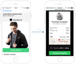
Modest Control Panel

Screenshot of Modest Control Panel
The Modest Control Panel was a multi-tenant Content Management System that allowed merchants to manage their Modest powered storefronts. Features included the management of store themes, payment gateways, shipping methods, orders, third party e-commerce product syncing, and even generating standalone iOS applications. The back-end of this app was built in Python using the Flask framework. The front-end was initially built with plain Javascript and jQuery, but was eventually migrated to React. As the Modest client application tech lead, I oversaw and greatly contributed to the overall product architecture and implementation of this web application.

Modest Commerce API

The Commerce API was a flask-based python API built to power storefronts for merchants using the Modest platform. I helped design and develop the initial architecture - including database modeling and endpoint design. As our company grew, I became the API consumer tech lead, so my API contributions switched primarily to endpoint contract collaboration.

Modest Web Store

Screenshot of Modest Web Store
The Modest Web Store was a mobile-first, responsive, multi-tenant web application that powered each of our merchant's web-based storefronts. In addition to (and more importantly than) a browsable store, it powered contextual buy buttons and instant checkout screens that could be embedded into ads, emails, and anywhere else on the web or in a mobile application. The client-side of the web store was initially built in Backbone.js and integrated with the Modest Commerce API via a thin Node.js proxy. Later, we started to migrate the front-end to Vue.js. I was the architect, tech lead, and leading contributor to the web client.

Modest iOS Store

Screenshot of Modest iOS Store
The Modest iOS Store was a multi-tenant, white label application that our merchants could easily adopt as a standalone app or as an SDK that could attach a storefront to their existing iOS app. When Modest was still young, and was "all-hands-on-deck," I got to do a bit of iOS development consuming the Modest APIs and rendering UIs.

Simple Auto Service

Screenshot of Simple Auto Service
In the early 2000s, I often found myself at a mechanic or auto-parts store needing to know the last time I performed a certain service on my vehicles. So I whipped up a tiny web-app to help track and display this information. A decade later I became bored while traveling, so I decided to clean up the old app and publish the code. It's a super simple PHP/MySQL CRUD application based off of an ORM and Model framework that I built after learning Rails in 2008. The app itself barely has any features but I published the code publicly to show some friends my simple PHP framework. Today, I'd just use a damned google docs spreadsheet to track this stuff.

Carfiend API

Screenshot of Carfiend API
Carfiend was a mobile application built for car enthusiasts to share photos of both their own cars and cars in the wild. The idea was that it would become an Instagram for gearheads. A couple friends and I were hired to build the backing API for the project. We collectively architected the application and built the API out in Python using Flask and SQLAlchemy. I built many of the endpoints and models for interacting with cars, photos, events, other users, search, etc.

Voter Registration SaaS

Screenshot of Voter Registration SaaS
Voter Registration SaaS was a thin, skinnable, multi-lingual, voter registration web application built on top of the DNC's Voter Registration API. This app lived in several places - most notably at the hilariously named gottaregister.com, which was mentioned by President Obama in several speeches, on television, within social media and even on reddit. In most states, this application basically acted as a fancy PDF filler that the user could print and mail in. However, it also allowed us to capture their information so that we could follow up and target that potential voter in the future. I inherited this application early-on and was in charge of making sure it was both stable and scalable while overseeing implementation of the campaign's evolving feature requests. It was one of the most interesting applications to scale because it rarely received organic traffic. It would get absolutely slammed when the president or some celebrity mentioned or linked to the application in speeches, on air, or in social media. This was addressed by extensive caching, limiting dynamic content on landing pages, and queueing API requests in the event of API downtime or latency. The queueing backup that I implemented (using Amazon's SQS) saved us thousands of voter registrations alone. We also made this application embeddable and eventually open sourced the core of it.

Call Tool

Screenshot of Call Tool
Call Tool is a phone canvassing web application used by both Obama for America and the DNC. In its simplest form, it provided volunteers with a potential voter to call and a relevant script to read. The volunteer could then record the answers from the potential voter, which were used to learn more about how the campaign should be operating or targeting individuals. Underneath its shell, Call Tool had a fairly complex architecture that proxied all of its data through our Narwhal API and interfaced with a Voter Checkout Service API and synced with 2 of the campaign's vendors. I architected and built the Call Tool web application and its communication with the Narwhal API from the ground up. I also extended several parts of the Voter Checkout Service to make it more performant, tighten protection against fraudulent callers, and better integrate with our vendors. As I took on other tasks on the campaign, I worked with other engineers and oversaw all development on the application.

Voting Location Lookup

Screenshot of Voting Location Lookup
The 2012 Obama Re-election campaign was a firm believer in that the more voters who turn-out to vote the more likely Democrats are to win the election. With that, the campaign put a huge effort into cataloging voting locations and making sure voters had the tools they needed to find these locations. As the lead engineer of voter contact I architected and built the data layers, integration tools, and APIs to allow client applications to get at the data. I worked very closely with our data team, the DNC, voting location experts, and our front-end team. Despite the incredible challenges that came with the constantly evolving, incomplete/disorganized data and different laws/rules in each state, we built a comprehensive, nation-wide election day lookup tool. In addition to that, we built the first ever nation-wide "early vote" lookup tools. Not only was this data available via online lookup tools, it also integrated with DNC applications and allowed our phone canvassing applications to automatically display relevant voting locations for the canvassed voter.

Narwhal

Screenshot of Narwhal
Narwhal was the famous technology infrastructure behind Barack Obama's 2012 Re-election campaign. It was a Python-based interface and integration layer that allowed us to unify the disconnected pieces of what we knew about voters, volunteers, event-goers, voting locations, etc. I was one of the top 5 contributors to the Narwhal project. The integration side was a small web layer that handled syncing data with our vendors in real-time. Incoming data was saved to a local database and then became queued via SQS for translation and loading (by our integration workers) into the Narwhal interface layer. Here, I extended existing integrations and built some parts to sync voter applicant and precinct data. The interface side allowed us to use this unified data to quickly build dozens of client applications for various tasks across the campaign. I spent most of my time in Narwhal building and extending models and endpoints to support client application needs. The pieces I worked on helped support pollster surveys, phone canvassing, volunteer organizing, image processing, voting location lookup, incident tracking, etc. I also built a thin Ruby Gem that allowed our ruby based API consumer applications to quickly and easily interface with the Narwhal API.

Debate Watch

Screenshot of Debate Watch
Debate Watch was a web application loosely based on Planned Parenthood's "Pledge a Protestor" program. The basic idea is that you make your opposition pay for negative actions by allowing your supporters to pledge money each time the opposition attempts slander. With Debate Watch, we took some of the Republican candidates' favorite demeaning terms and promoted them on our site along with some fact checking. Obama supporters could then pledge to donate a certain amount of money each time a given word was said during the debate, and of course put a max cap on their donation in case something got out of control. We had a team of word trackers stuffed in a room listening to the debate and tallying the terms in real-time. On the website's front-end the words would then re-arrange and scale in real-time as our pledgers watched. I built the entire back-end of the application along with the word tracker and a small JSON API for consumption by our front-end team. This application was built primarily as an experiment to test some of our scaling and payment infrastructure but managed to be quite fun and also earned us tens of thousands of dollars early on.

Artworks

Screenshot of Artworks
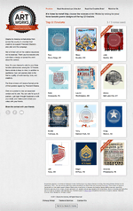
Artworks was a web application that allowed Obama supporters to vote on items in a contest. It was primarily used for promotional poster competitions. This app was built in PHP using the Kohana PHP framework. I worked on some of the core functionality of this application as well as built the basic CMS. I also integrated it with Facebook's Open Graph API to allow users to login to vote as well as publish custom open graph actions to their timeline. Unfortunately we launched this before Facebook's custom actions had publicly launched, so we didn't get to use that portion of the app.

Tweet your Rep

Screenshot of Tweet your Rep
Tweet Your Rep was a simple application that allowed supporters to easily post tweets to their state representatives based on current issues. It allowed Obama For America to create a promotional campaign, select the chambers and parties to target, and then add some pre-built tweets templates for supporters to use. I architected and built the API layer and basic CMS as well as integrated it with the Twitter and the Sunlight Labs Congress APIs.

Debate Quotes

Debate Quotes was my first assignments after joining Obama for America, and my re-introduction to Rails after not using it in over a year. It was built to keep track of, call out, and fact check quotes during the early Republican debates. Technically, it was a basic CRUD Rails application that exposed both normal views and a JSON based API for use by the front-end. We had this application in production 72 hours after I joined the campaign and iterated on it for another debate a few weeks later.

VocalFi

Screenshot of VocalFi
VocalFi was a telecommunication service that offered web-based conference services. Much of the application was built by young contractors using the Cake PHP MVC framework. I was later hired as a short-term contractor to make the application cacheable via MemCache. This entailed a lot of code abstraction and heavy cleanup to reduce the incredible amount of code duplication. Once that was done, we were able to easily add meaningful caching.

Des Moines Alive

Screenshot of Des Moines Alive
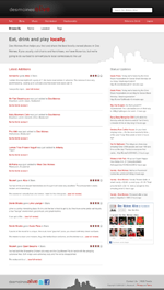
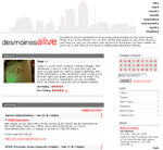
Des Moines Alive is a personal project that my friend Nick Leeper and I built to help Des Moines Area folks find awesome local bars and restaurants. In addition to general merchant info, we provided users with aggregated data such as reviews, foursquare tips, merchant tweets, etc. We designed Des Moines Alive to be very lite and easy to navigate. The goal was to provide our visitors with the information they wanted as quickly as possible.

v2 - latest version

Nick and I decided to use this version of Des Moines Alive to learn new things, play with APIs, and switch our focus to local businesses. We built our own custom PHP MVC, with ideas borrowed from our experiences with Rails and Kohana. We redesigned our database to be more efficient. We also began using many more APIs such as SimpleGeo, Google Maps, Facebook, Foursquare, and Twitter to aggregate data and give our users more information.
Dipity

Screenshot of Dipity
In short, Dipity was an interactive digital timeline web application with a hint of social networking. We built an incredible web-based tool that allowed users to create, share, embed and collaborate on interactive timelines that integrated video, audio, images, text, social media, geolocation and of course, accurate timestamps. Timeline viewers could pan around and zoom into these timelines for a very nice, visually engaging experience. Being that it was all built in vanilla javascript, it even worked, and was incredibly responsive, on mobile devices, ipads, etc.

v3 - latest version

Building Dipity 3 is the main reason I was hired. Version 2 was a couple years old. The design was dated, its timeline widget was built on the YUI library, and was generally inefficient. Dipity 3's goal was to update the look, improve the widget's efficiency, support HTML5 guidelines, function on mobile devices, and provide several new features. I built the front-end from the ground up, added several new features in both the front and back end (including Facebook connect, better registration process, etc), and worked closely with our other part-time engineer on the completely rewritten javascript timeline widget. I spent a lot of time making sure that the new Dipity timeline widget worked on mobile devices such as androids, iPhones, and iPads.

Harper Soundboard

Screenshot of Harper Soundboard
Several years ago, my friend Harper Reed figured out a way to hack into my phone (from a few hundred miles away) and change my voicemail... and at the time of writing this app - I still hadn't changed it. So when Harper asked me to make an Android app for a little contest, I thought, what could be better than a soundboard about hacking phones? So this was my app... it's pretty dumb, but it was a great intro to Android development. Plus, I got to brush up on some Java. I published this app to the Android market as a free app. Within the first week, I had around 250 downloads, about 60% of which uninstalled the application shortly after playing with it, haha. However, I did have an average rating of 4.5 stars... they were all my friends I'm sure.

Perficut

Screenshot of Perficut
Perficut is one of the leading landscaping and lawn service companies in Des Moines, IA. They came to our company, Red Five seeking a more serious web presence along with some custom tools. In addition to a complete redesign built around our CMS, I also built a large custom irrigation and service scheduler for Perficut and their clients. This scheduler allowed Perficut to define a season, serviceable neighborhoods, average appointment times, the number of crews available, and other small details. From here, the tool allowed Perficut to assign crews to neighborhoods (based on stats from the previous season). Once this was all set up, customers could visit Perficut's site to schedule sprinkler system startups, shutdowns, and service. On top of this custom tool, I was also in charge of integrating this site into our SiteMan CMS and deploying the site.

PREIT iPhone App

The PREIT iPhone app was a small, marketing and informational application for each of the company's 30-40 shopping malls. The application used your phone's current location to find their nearest mall, give information about the mall, store directories, SVG based maps, calendars of events, etc. One other engineer and I created an API for our Rails-based CMS and then built most of the native Objective-C iOS app prior to me leaving the company... at which point a 3rd party contractor finished and "polished" the application

Philadelphia Marketplace

Screenshot of Philadelphia Marketplace
Philadelphia Marketplace is the shopping center located within Philadelphia International Airport. They hired Red Five to update their site, give them a content management system and also set up interactive maps for their shopping center. This was a pretty simple project from an engineering perspective. I was in charge of integrating the design into our CMS, writing a bit of javascript for the front-end, and finally, deploying the site.

Valley West Mall

Screenshot of Valley West Mall
Valley West Mall is a long time Red Five client and was sort of a guinea pig to test out the latest version of our SiteMan CMS and the brand new javascript/HTML5 based SVG map UI that we'd built. Rebuilding the Valley West Mall site with our new technology was a great learning experience. We greatly improved our CMS, made things much more efficient and moved from Prototype to jQuery. Rendering maps with javascript rather than flash meant they could be viewed on mobile devices, iPads, etc. In addition to these great new features, Valley West requested to be integrated with their Twitter account. This allowed me to build a twitter plugin for the SiteMan CMS which would allow the mall to easily post tweets as well as monitor mentions and replies.

Bix Produce

Screenshot of Bix Produce
Bix Produce is a produce distributor based in Minnesota. They became interested in my company, Red Five after seeing the produce site that we built for Loffredo. I was in charge of integrating the design we came up with into our SiteMan CMS, and also deploying the site for Bix.

Smithson Woodworks

Screenshot of Smithson Woodworks
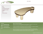
Smithson Woodworks is a side project that was run by my cousin-in-law, Jon Smithson. One year we decided to trade, he'd build me a component rack for my entertainment center, and I'd help him get his stuff online. Jon sent me a logo and some photos of his work, I helped him by setting up a Wordpress site that integrated with a Flickr account. Jon simply uploaded photos and created albums on Flickr and those would become automatically mirrored to the portfolio on SmithsonWoodworks.com.

Mary McAdams

Screenshot of Mary McAdams
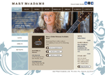
Mary McAdams is a Des Moines area folk artist who was becoming super well known in the area. Mary hired my friend Mindy Hoskin as her designer - and Mindy approached me to bring her designs to life. Having a small web budget and not a lot of time, I used this opportunity to brush up my WordPress skills. I was able to build Mindy's designs out into a WordPress template and still keep a lot of the custom functionality that Mary wanted. Along with her blog, Mary also wanted a lot of multimedia - photos, video, a music player, show times, downloads, etc. For photos, I was able to customize one of the many WordPress Flickr plugins to work with Mindy's design. Show times and the Music player were powered by Mary's ReverbNation account. To make show times work, I hooked her ReverbNation calendar RSS feed to FeedBurner BuzzBoost and embedded the generated BuzzBoost into her blog accordingly. Combined with Mary's active social networking, I think we were successful in getting all of her info in front of an audience in an elegant way.

Holiday eCards

Screenshot of Holiday eCards
This is a microsite that I built as a marketing tool for malls owned by PREIT. It allowed people to customize and send flash-based cards to friends and family. It was also built so that a campaign could be coupled with a contest. For example, all cards sent to moms on mothers day could be eligible for a mall gift card. For delivering the cards, I wrote a small script using the WhatCounts.com API. This little application was a lot of fun to work on and a huge success for the associated malls.

v2 - latest version

The Holiday eCard microsite was brought back to life for the winter holidays in 2009. Only this time instead of supporting only 3 malls, it was to support ~40 malls. That said, there were many performance improvements and generalizing of the codebase. The site was a great success receiving several hundred cards.

Letters to Santa

Screenshot of Letters to Santa
"Letters to Santa" was a micro site that we built for participating malls owned by PREIT. The site allowed kids to write letters to Santa and Santa would eventually reply. Santa had a handful of random responses that he sent back to the kids (via CRON job) just before going to bed. This was a fun little microsite to build. I modeled and handled all of the dynamic functionality, storing the kids' letters, and writing the scripts to help Santa reply in a timely manner.

v2 - latest version

The second version of this site supported around 40 malls rather than the few malls it supported the first year. With that, I was able to clean up and generalize a lot of the code. I also changed the email functionality to use the WhatCounts.com API to help Santa send emails back to kids.

Countryside Motorsports

Screenshot of Countryside Motorsports
Countryside Motorsports is an interesting little site that I was able to crank out pretty quickly in 2008. However, we got it done right when our client got super busy, so it sat unlaunched for about a year until we were able to resurrect, update, and launch the site. It was a pretty basic marketing/inventory viewing site for an ATV, Snowmobile dealer in Iowa. I modeled and built a custom admin for managing inventory, specials, and homepage banners.

TowRate

Screenshot of TowRate
TowRate was a startup that offered a custom service to towing companies. The site allowed subscribed companies to manage their assets, map routes, and calculate profit margins for every tow. It was built in a way that allowed the towing companies to quickly run these calculations while on the phone, so they could figure out the most profitable way to charge for each tow. On this project, I was in charge of pretty much everything except for the initial design. My job involved data modeling, loads of calculations, back-end development, front-end development, form design, and deployment. TowRate was a very javascript heavy application, using plenty of asynchronous calls for things like sorting, calculating rates on the fly, and grabbing map data from the Google Maps API. The Maps API was used to help determine mileage and time for each tow. From there, the app used extensive math and formulas to help find the best price for each call. Companies were able subscribe to TowRate on a monthly or yearly basis. I integrated PayPal's Web Payments Pro to handle these subscriptions; let users join, autorenew, enter discount codes, cancel accounts, etc. Subscribed companies could also manage their trucks (as well as truck expenses), users, tow rates, tax areas, routes, etc. It provided an all around fleet management solution to any towing company.

West Bank

Screenshot of West Bank
West Bank is an Iowa based bank that my company, Red 5 Interactive, had been working with for years. When they came to us for a redesign, my assignments were to integrate our in-house CMS, build a couple plugins, and build functionality to capture a user's zipcode and display the appropriate location-based content. The plugins I built were based on previous functionality they had and wanted to retain: current loan/savings rates, alerts, and custom newsletters.

Iowa Alcoholic Beverages Division

Screenshot of Iowa Alcoholic Beverages Division
Iowa Alcoholic Beverages Division is responsible for the regulation and control of all alcohol and tobacco in the state of Iowa. The division has generated hundreds of millions of dollars for the state of Iowa. Our company, Red 5 Interactive had hosted IABD for years. Up until this rebuild, they were one of the very last Java based sites running on an ancient server stuck in a closet in the back of our office. As time went on, it became scarier and scarier to let their site remain live. Once showing IABD the physical server they were running on, talking them into a complete rebuild was no challenge at all. One of the most daunting parts of this rebuild was the task of migrating all their content. I heavily modified our internal Site Spider to accomplish this task. The client had around 400 pages and 700 files that were linked to (mostly PDF press releases). I had to completely crawl their site, import everything into our CMS and fix every link to work correctly. Given the fact that they had FTP access to the old server, things were a mess, and this was not a simple task. I'm talking about some serious site scraping madness! Being such a large site, this client came up with all kinds of awesome ideas for our CMS, which I was able to add-on and commit back to the repository for our other clients. After setting up our internal CMS and importing their hundreds of pages/files, I had to build a Javascript Fund counter to display on their homepage. Basically, the client takes their projected income, enters it into a custom tool that I built in SiteMan, and my JS did the math to determine how much money was being transferred to the state every second. It then dynamically animated a count-up on the homepage. I also built some fancy, custom (and totally dynamic) javascript dropdown navigation. Finally, I had to model and build a custom plugin to allow IABD to import CSV files of their alcohol products, stores, and tobacco compliance data. Then, I built functionality to browse and search all of this data on the front-end. At the time, Iowa Alcoholic Beverages Division was basically a test of all my skills. Sys admin, back-end development, front-end development, scraping, importing, and finally deployment.

Loffredo Fresh Produce

Screenshot of Loffredo Fresh Produce
Loffredo is a high-end produce company serving much of the Mid West. When our company was hired to rebuild their site, my assignments were to integrate our in-house SiteMan CMS, create some plugins, build in a fancy javascript fruit carousel, and of course deploy the site to our production server. The plugin I built for this site simply allowed Loffredo to manage branches and employees and allow site visitors to contact them. The fruit carousel I mentioned was a custom javascript animation that cycles through various fruits on the homepage.

Michael Annett

Screenshot of Michael Annett
Michael Annett was an upcoming race car driver from Des Moines, IA. We didn't build his site from scratch, but when his site development/hosting company stopped providing good service, we were asked to take over. The former host of michaelannett.com was not very cooperative in the site transition - so we had an interesting time getting Michael's content for him. To get Michael's site, we wrote an internal app called Site Spider to crawl his existing site, save all the pages, their images, stylesheets, javascripts, etc - all while preserving the links and folder structure. Once I successfully crawled and downloaded this site, I put this app into our internal Content Management application, SiteMan. I also built a couple custom SiteMan plugins, which included a photo gallery and online store management. The store they wanted was fairly small, however, no matter the size, building an online store is quite an effort. After launch, Michael was able to easily update news, photo galleries, results, schedules, general web page content at anytime, and could sell his gear online.

FTTHCAP Conference

Screenshot of FTTHCAP Conference
Fibre To The Home Council Asian Pacific (FTTHCAP) is a non-profit organization aiming to promote and accelerate Fibre To The Home - obviously in the Asian Pacific. FTTHCAP hired our company to build an easily manageable site to help promote and provide information on their 4th annual conference. Once the design had been built out, my job was to stick everything into our internal CMS application, SiteMan, and get it deployed ASAP. This was our first installment of SiteMan on a single site system, so it was a great trial run. Despite a couple "gotchas," I was able to push this site out with our SiteMan CMS very rapidly. During this launch I was also able to fix up some loose-ends that I found in SiteMan, thus enhancing our internal application even further. After the launch, FTTH was able to easily edit any and all content via WYSIWYG editors.

Site Spider

Site Spider is an internal application that we wrote at Red 5 Interactive. Its purpose was to crawl an entire website and save everything (pages, stylesheets, javascripts and images) locally. We originally wrote the app when a client's previous web host was unwilling to surrender their data. It was incredibly useful for our company to scoop up new business from uncooperative providers at the time.

S & C Automotive

Screenshot of S & C Automotive
S & C Automotive is a company that provides vehicle warranties and protections to local car dealerships. If you bought a car from any of several dealerships in Iowa, you'd be offered a set of warranties - paint protection, rust protection, etc. These protections were all sold to the dealerships by S & C. I built a web application to allow S & C to manage these protections and offer them to dealerships. The dealerships had their own accounts and could log in and select each protection that they sell. Then, S & C could view, process, ship, and bill for these registrations.

PREIT Malls

Screenshot of PREIT Malls
PREIT (Pennsylvania Real Estate Investment Trust) invests in shopping malls in the eastern United States. PREIT is one of the primary consumers of our internal CMS project, SiteMan. We successfully deployed SiteMan to allow PREIT to manage over 40 of their mall websites - all from 1 location. One challenge we faced with this project was PREIT's constant seasonal marketing campaigns and presentation layer redesigns. As such, we built SiteMan so that new presentation packages could easily be added into SiteMan for each of these campaigns. We also allowed for mobile designs to be appended to each of these presentation packages for easy mobile browsing.

SiteMan

Screenshot of SiteMan
SiteMan is a Content Management System that we built at Red 5 Interactive. It was originally built so that mall property owners could manage each of their mall property's websites. However, once we realized how powerful our system was, we decided to generalize the app so that we could deploy it for all of our clients. We rebuilt SiteMan to allow our clients to easily manage a single website or a group of websites. This way, a parent company could edit any of their child company websites, while employees of the child companies would only be able to see and manage their respective site. The front-ends of the sites managed by SiteMan were also completely extracted from SiteMan itself, which was great for 2 reasons. First of all, it allowed us to more easily keep all of our clients' systems up-to-date in that we were just updating SiteMan and not touching their presentation layer. Secondly, it also allowed us to launch new campaigns and designs for clients very quickly without touching the content management system. When we deployed SiteMan for a client it came with a core group of tools like user management, web page editing, file management, audit logs, etc. From there, custom tools could be added as plugins. These tools included functionality like, announcements, events, careers, photo galleries, stores, social networking, etc. We also built SiteMan in a way that allowed users to customize their tool layout. Any user could pick which tools they used the most and arrange them in a way to get a quick snapshot of the exact data that they were interested in. Tools could be added, removed, or sorted at any time - and everything remained just as they left it on their next visit. This application was very Javascript heavy, making extensive use AJAX, dialog windows, and WYSIWYG editing. As such, we had minimal page loads which provided a very streamlined experience for our clients. I am very proud and excited to have worked with such a great team on this app. It was so versatile and simple to keep pushing forward.

NAPA Sales Driver

Screenshot of NAPA Sales Driver
Edwards Graphics Arts (a partner to NAPA) hired our company to build a web application for distributing posters and flyers to NAPA's retail stores. Each store could purchase any of several different promotional products. This is a process that NAPA and it's 3rd party designers had previously handled over the phone. I built a web application to help streamline this process and eliminate phone ordering. This app allowed Edwards Graphic Arts to upload and edit designs for the stores to order. Retail store managers could then visit the site and order promotional products that fit their demographic. This site was very javascript heavy with a lot of asynchronous calls to provide a quick user experience. I also integrated it with PayPal's Pay Flow Pro to allow for online payment.

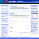
Des Moines Broomball

Screenshot of Des Moines Broomball
I am a broomball player. Broomball is a sport similar to hockey but a bit more recreational. Once my Broomball league caught wind of me being a well-connected, tech savvy guy, they nominated me to be the Marketing Director. As marketing director my main purpose was to help promote the league - and what better way to do that than to build a fancy website. Not having hardly any time to devote to this project, I decided to try out a product that I'd heard a bit about, called Drupal. The Drupal Content Management System was a pretty great little app. I literally had a community site up and running within an hour. The Drupal community had written so many modules, that I didn't have to write a single line of code to get the site off the ground. After installing a handful of modules, a bit of layout tweaking, and modifying a tiny bit of PHP, we had a completely functional site. I even got the help of designer Kathryn Downing to whip up that logo in a matter of about 25 minutes. I wouldn't use Drupal for everything, but it was definitely an excellent solution for this project. The site helped the league gain players and teams for our regional tournaments.

TMC Transportation

Screenshot of TMC Transportation
TMC, a local trucking company with some of the most beautiful trucks that I've ever seen, hired us to rebuild their website and enhance their web presence. I was in charge of modeling and building a system to manage employees, sales reps, and news. The sales rep data was fed to flash maps via XML. The careers page was built by consuming a remote XML feed.

Monroe Marketplace

Screenshot of Monroe Marketplace
Monroe Marketplace is a shopping center located in central Pennsylvania. Their parent company, PREIT hired us to build a promotional website during the development of the shopping center. My primary tasks were to build a blog, calendar, polling, and a job posting system. Each of these tasks were fairly trivial in that I've done them several times, but it was my first opportunity to write a polling system and I thoroughly enjoyed that.

Signs Plus

Screenshot of Signs Plus
Signs Plus is a Des Moines area company who is responsible for some of Iowa's most impressive signage. They hired my company, Red 5 Interactive, to completely rebuild and rebrand their site. They wanted something that was loud, colorful, and gets their products right in front of the customer. Our designer took care of the visual aspects, while I was in charge of modeling and content management. The major function of the admin panel was to allow Signs Plus to upload photos of their work. The images were dynamically resized in several ways to fit the flash-based home page, as the rest of the site. Being that the homepage was flash, I also built some dynamic XML endpoints to feed data to power the animations. Shortly after release, we received emails from Signs Plus saying that they were already getting new business based on the quality of their site.

iTunes Web Remote

Screenshot of iTunes Web Remote
In 2008, I bought a couple Airport Express modules to create an iTunes controlled whole-house-stereo. It was awesome until a terrible song would come on and I'd have to run upstairs to skip to a better tune. Apple quickly became aware of this problem and released an iTunes remote for iOS. However, at the time I didn't have any iOS devices and I couldn't justify spending a few hundred dollars for an ipod touch/iphone music remote. As such, I decided to build a remote of my own. Using PHP and AppleScript to communicate to iTunes, I was able to whip up a super light web-based remote that ran on my Mac. With "LAMP" running locally, I could visit the IP of my Mac from any device on my internal network and navigate my songs. At the time, I used this to switch songs via my blackberry, sidekick, a PSP, or even our Nintendo Wii. It was great for parties!

Keokuk County State Bank

Screenshot of Keokuk County State Bank
Keokuk came to us with a redesign in mind and also wanted the ability to easily update loan rates, add news articles, and attach rich media to those news articles. Keokuk's website wasn't too programmatically intensive, but it did give me an opportunity to try out some new Rails ideas. While building this app, I found a Rails plugin called ActiveScaffold, which made a standard CRUD scaffold that was very javascript heavy with a lot of asynchronous calls and very few page loads. It was a fun plugin to play with and after a bit of modifying and extending, it seemed to fit the bill for this project.

Adium Status Plugin

Screenshot of Adium Status Plugin
Adium was a multi-protocol chat client for Mac OS. I enjoyed it because it let me connect to AIM, Google Talk, ICQ, and other popular chat clients from the early/mid-2000s. Shortly after getting Adium I installed a TwitterAdium plugin (aka Xtra) that would set my current status to whatever my most recent tweet was. The problem that I had with this plugin was that I had too many apps hooked to my Twitter account and was running into rate limiting issues on their API. I had derek.broox.com, Facebook, MySpace, and Adium all hitting Twitter, which made them sad. Since derek.broox.com grabbed and cached my Twitter status, I decided to be nicer to Twitter and write an Adium plugin to grab my status from derek.broox.com. I built the plugin with Ruby and made it configurable via YAML. I simply defined the url and duration in the included YAML file and set my Adium status to %_RemoteStatus. That would then periodically hit my website to fetch my status and allow all of my chat contacts to follow what I was doing while I was on the go.

Cownie For State House

Screenshot of Cownie For State House
Iowa Republican Peter Cownie hired our company to build a promotional website during the 2008 election. He wanted a pretty standard, informational site with a blog, and some photos. Since so many of our clients wanted blog-like functionality, I built a Rails blog plugin (named Bee-Log) and this site was the first to make use of it. I also integrated this site with the Flickr API to display photos from Peter's Flickr account. P.S. Peter Cownie won. Probably because of this website.

Justin Marks Racing

Screenshot of Justin Marks Racing
The company I work for, Red 5 Interactive was hired to build a site for NASCAR truck driver, Justin Marks. Our basic guideline from the driver was to "make it like Bam Margera's site." He really enjoyed moving elements, photos, and of course - a music player. My job was to integrate the site with Justin Marks' Flickr account, build XML feeds to power our flash app, and also build a non-flash version of the site.

Glimcher

Screenshot of Glimcher
Glimcher is a premier real estate investment trust that manages malls and shopping centers across the United States. They came to my company, Red 5 Interactive, seeking a corporate website. My company had already built and launched this site by the time I began working on it, so my job was simply to enhance some features on both the admin and the front-end. Glimcher wanted a near real-time display of their stock price on the homepage. However, there weren't any great services to grab this information at the time, so I built a CRON scheduled script to scrape a couple quote sites and grab their stock price. Whenever the price was successfully grabbed, the price was written to a local file that was read by the website. Glimcher also wanted real-time stats on their leasing informational pages, so I added some functionality to display updates on leasable square feet, property count, etc. Finally, they wanted to be able to quickly show/hide all dynamic content on their website. I added some simple toggling as well as drag/drop sorting to any and all data in the CMS.

Team 46

Screenshot of Team 46
Team 46 is a group of service and avionics specialists working at the Des Moines Flying Service (DMFS). They hired our company, Red 5 Interactive, to make a micro-site for their technicians. The Team 46 micro site was pretty straight forward. They needed a way to blog, manage case studies, take service requests, and upload photos. For the blog, I simply installed an internal blog plugin that I'd previously built. Everything else in the CMS was custom programmed. There was nothing crazy about this app, but everything was built and deployed very smoothly.

The Bellevue

Screenshot of The Bellevue
The Bellevue is a building located in downtown Philadelphia that houses restaurants, shops, and a hotel. They hired my company, Red 5 Interactive to build an informational site for them. I built a small, custom content management system for this site allowing Bellevue to manage events and photo galleries. The photo galleries could be organized and sorted via drag and drop.

Audit Trail

Screenshot of Audit Trail
The Audit Trail is an internal application that I built for Red 5 interactive. When we built sites for clients, it was often helpful to track all administrative actions that took place in their content management systems. This allowed us to easily troubleshoot content issues - accidentally deleted data, bad actors, security breaches, etc. We were duplicating much of this functionality for several clients, so I whipped up an Audit Trail app. I built it so that it could be deployed in 2 separate ways. The first, and most commonly used way was for our client applications to call a centrally hosted Audit Trail as a service. With most of our clients hitting the same service, we could keep a close eye on what all of our clients were doing. The second way was to install the Audit Trail as a separate app for any given client. We generally only did this if we anticipated a large amount of logs, or if we had a client that managed several sites. The app and service was incredibly useful. Our clients really enjoyed being able to easily see what was being updated and who did the updating.

Countryside RV

Screenshot of Countryside RV
Countryside RV was my first complete Ruby on Rails site. I was the main programmer for this project while working with Red 5 Interactive. Our designer and front end developer took care of most of the design and html build-out. I was in charge of modeling and building the actual application and content management system. The primary function of the site was to display all of Countryside's current RV inventory. Countryside could add a large amount of detail as well as upload multiple photos of a given RV. We've also implemented a "Buyers Gallery" that allowed some visible interaction with Countryside's user base. When someone bought an RV from Countryside, they'd be featured on the website with their new camper.

BRT Realty

Screenshot of BRT Realty
BRT Realty is a commercial real estate company who my company, Red 5 Interactive hosted. I came into this project a bit late, so I didn't have a whole lot to do with the overall buildout. However, I did build most of the forms for collecting visitor information. I also handled some dynamic content display, etc.

Five Point Studios

Screenshot of Five Point Studios
Five point studios was a professional piercing and custom tattoo shop in Johnston, IA. I was hired to revamp their severely outdated website and built them a custom content management so the shop could manage any page as well as manage staff members and portfolios. I incorporated one of the shop's tattoo sketches into the design along with a fancy font that they requested. As with any website, if the visitors don't have that font installed, they won't see your fancy text. So, using PHP's GD library, I wrote functionality to dynamically load their font and create fancy title images on the fly. The site was much more successful in allowing Five Point to showcase the incredible work that consistently came out of their shop.

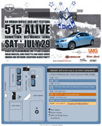
515 Alive

Screenshot of 515 Alive
515 Alive is an urban music festival that takes place in Des Moines, IA. We donated this simple dynamic informational site to relay event times and locations. The site's simplicity was largely due to the very short deadline and last minute event changes. I worked closely with a local designer for some of the elements.

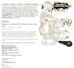
Aeon Grey

Screenshot of Aeon Grey
I built this site for Aeon Grey, a Des Moines hip hop artist, to promote both himself and his 5th solo album: Primate Curriculum. Aeon Grey wanted a very lite site that would include a forum and also allow him to publish photos, videos, and mp3s. The site's news was integrated with the forum to allow Aeon to display important updates on both, the forum and the home page. I worked graphic designer, Mindy Hoskin, for the graphic elements, which are taken primarily from the album art that she designed. I also did some of Aeon Grey's photography and videography.

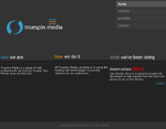
Truespin Media

Screenshot of Truespin Media
Truespin Media was a small partnership that my friend, Nick Leeper, and I started up to work on side-gigs. We originally planned on offering several services including: video production, photography, graphic design, and web development. However, we focused primarily on the development and design pieces.

v2 - latest version

After realizing that we were mainly focusing on web development and not the other services we offered, we decided to redesign our website. This version of our site was much lighter and contained only information relevant to development. With this release we also drastically updated our outdated portfolio. with all of the work we were doing, we didn't have enough time to update our own site!
Rebels Advocate

Screenshot of Rebels Advocate
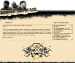
Rebels Advocate was a Midwest Hip Hop group that got together in Iowa City. With their gaining popularity they decided they needed a strong web presence to show the world what they were all about. Rebels Advocate was referred to my partnership needing both a website and a music video. With a very limited budget, we had to cut a lot of corners, but the results of both the video and the website turned on great. The site allowed visitors to check out their bios, video, photos, and most importantly, their music. We also installed a community driven forum to keep visitors coming back to the site and gave them analytics to track the site's traffic.

Iowa Business Alliance

Screenshot of Iowa Business Alliance
Iowa Business Alliance came to my partnership with a design in place, but they needed help bringing their vision to life. We built them a useful, dynamic website with a custom content management system that they could use to attract potential clients.

Iowa Retail Federation

Screenshot of Iowa Retail Federation
Iowa Retail Federation came to my partnership wanting to refresh their current site. The content on their site was sufficient, but they wanted a way to manage it easily and efficiently. We worked with them to provide a website with a custom content management system to meet their current and future needs.

Soft Focus Art

Screenshot of Soft Focus Art
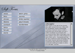
Soft Focus Art was a local Hip Hop and DJ group who came to my partnership with a limited budget and hopes of a fairly complex, dynamic website. They wanted to be able to update their viewers with bios, media, news, and information about upcoming shows; but they also wanted to keep the design simple with crisp lines and have everything animated via Flash. We helped them out and provided a simple animated design with a PHP/MySQL content management system that delivered XML to the Flash module to display the dynamic content.

Iowa Meth Watch

Screenshot of Iowa Meth Watch
Iowa Meth Watch (local partner of the national Meth Watch program) approached my partnership seeking a website similar to the larger organization's, but with more localized content. We recreated graphics, created and enhanced flash animations, cleaned up code, and added new content to help integrate the state of Iowa into the Meth Watch program.

Falaphilia

Screenshot of Falaphilia
On October 14th 2004, Bill O'Reilly from Fox News was threatened with a sexual harassment lawsuit. A typo was made on the lawsuit transcript, where instead of "loufa," the officer wrote "falafel." Some friends and I found this hilarious, so we coined the term "Falaphilia" and put this website together. Even though it was just a joke. We ended up having approximately 50,000 visitors in the first 48hrs and peaked at 100,000 visitors in the first week. We then switched it up and served large political content to the blogger demograph and pulled 3.7 terabytes of transfer in 5 days. I handled the design of this site as well as some creative content, and made a graphic of O'reilly hugging a giant piece of falafel.

SAE Long Beach

Screenshot of SAE Long Beach
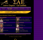
A friend of mine from the Long Beach chapter of Sigma Alpha Epsilon contacted me seeking some extensions to their current website. They wanted a content management system to allow for easy management of active members, alumni, alumni job postings, dues, a calendar of events, etc. My partner and I were able to provide them with a very user-friendly administration panel to manage all of this data. SAE also wanted a photo gallery and forum which we installed and fit 2 previously built systems for.

Trek For Kids

Screenshot of Trek For Kids
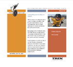
Trek For Kids was a fundraising bike ride for The Boys and Girls Club of Dane County. Their website provided information about the ride, allowed people register to ride, and also let people make pledges to the registered rider. A friend of mine contacted me to contract out the development for small section of this site. Shortly after, my partner and I were hired to design and program the rider registration, pledge donations, and full administration/reporting tools. This was our first time diving into accepting credit card payments, but we were able to get the registration and donation sections up and running on a secure server and used encryption in order to ensure protection for the visitors. The administration panel let Trek For Kids manage users, teams, donations, etc. It also provided full reporting to keep them up to date on number of registered riders, team rosters, and pledge standings.

Vedanta Gallery

Screenshot of Vedanta Gallery
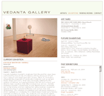
Vedanta was an Art Gallery located in Chicago, IL. They approached my partnership seeking a PHP extension to their existing site, which listed past, current, and upcoming exhibition details along with photos related to each. As such, we designed and built a light content management system that allowed them to easily manage exhibitions and photos that would be displayed on their front end. Vedanta changed their name a while after this launch, but they continued to use the CMS that we built for quite some time.

Regulatory Solutions Inc

Screenshot of Regulatory Solutions Inc
Regulatory Solutions Inc. wanted to get an online presence established and approached me and my partner to help them get started. The goal of the site was to provide a large amount of regulatory information to their customers in a quick and digestible way. To accomplish this, we designed a simple, flexible content management system that allowed Regulatory Solutions to easily add and manage users, documents, and updates. The finished product enabled their customers to get the most up-to-date news to help with their regulatory decision making.

Learn To Yo-Yo

Screenshot of Learn To Yo-Yo
Learn to Yo-Yo was a site dedicated to teaching kids new yo-yo tricks. Pro yo-yoers would update the site with videos and tutorials. My job in this project was to simply come up with a lite front end design, which you can see displayed here.

We Own The Sun

Screenshot of We Own The Sun
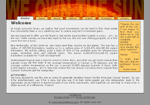
One day, a couple friends and I decided to claim the sun. As such, we quickly designed this website to let the world know that "we own the sun." The site we created sold plots of the sun as real estate and donated part of the profits to cancer research. I was in charge of the site's design and some of the creative content.

Solid Grind

Screenshot of Solid Grind
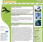
SolidGrind is a personal project that I developed as an extreme sports / soap shoes promotional and community website. It's the predecessor of my former Broox Extreme (www.broox.com) and BrooksFSW community sites. After I came up with the name and domain, I decided that rather than customizing a prebuilt system, I wanted to build this site from scratch. Developing the entire site myself was another great learning experience and paid off numerous times; I had full control and a great understanding of the system, so I could easily add on, fix bugs, and rebuild sections. One of the more fun parts of SolidGrind was the "feature pic" system. It allowed users to upload photos to be reviewed by the administrators that I'd hired. The uploaded photos were queued in a database and could be viewed/approved by administrators. Upon approval, the website would automatically size/scale the image, add a SolidGrind.com watermark to it, create a thumbnail, store it in the database, and feature the picture on the homepage until a new photo was chosen. In addition, I designed it so that each picture had to be featured for at least 24 hours; this gave everyone a fair amount of time on our front page. Besides photos, the site featured news, forums, tutorials, videos, and several other things related to extreme sports.

v2 - latest version

In 2006, I re-released Solid Grind to get away from publishing broader extreme sports content and focus on the grind shoe scene. There were so many other extreme sports sites with a full staff dedicated to maintaining them, but no one had this thorough of a website dedicated to the grind shoe scene. I worked with Nicole Sutherland on the design of this version, which turned out great for the content being delivered. The new version of the site was much more complete, the code was much more efficient, and photo manipulation was handled much better. With the initial version of SolidGrind I was very proud of the photo management system - this system was much cleaner and much more versatile in that most image manipulation was handled on the fly.
The Jugglers

Screenshot of The Jugglers
Three years after the original site had gone live Harper Reed hired me to do a redesign. The new site was basically a blog running movable type to update Jugglers in the Chicago area about upcoming events.

Wireless Wallpapers

Screenshot of Wireless Wallpapers
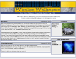
Wireless Wallpapers was a personal project of mine. It was a site that allowed users to download wallpapers for their early 2000s color screened mobile phones. At the time there were several sites offering this service however nearly all of them only supported one type of phone or charged money for each wallpaper downloaded (usually $1.00 per wallpaper). Wireless Wallpapers allowed users to download unlimited wallpapers for free, which were available for several types of phones. The free wallpapers had a tiny "wirelesswallpapers" watermarks near the bottom of the image, however if the user paid a small fee each month, they could get more features (such as private wallpapers) and the watermark was removed. In addition to this, I added functionality to allow users to upload their own images to the website which gave me the ability to let the site run itself. The website automatically resized the uploaded user images to fit various mobile screen sizes and printed my watermark to the image. The site was a huge success and learning experience. The first day it was online it received 7,000 hits and had nearly 100 users. After the first week there were nearly 50,000 hits and 500 users. Upon selling the site, I had over 24,000 users and received over 3,200,000 hits.

James H. Laas Company

Screenshot of James H. Laas Company
I developed this site for the James Laas Company out of Bettendorf, Iowa. At the time, it was one of the largest, most complex, and complete systems that I'd built. Prior to my development, they made all of their updates by updating static HTML files - a content management system was very much needed. They had a huge amount of content and product information that became quite redundant in the way that they were displaying it. I designed a more aesthetically pleasing site powered by a PHP/MySQL back-end. With the new design, I concentrated mostly on the ease of navigation and finding vital information quickly, which was successfully attained. Their site became completely free of managing and uploading static files and was updateable via the CMS that I created. The database proved to be very useful as the James Laas company wrote several articles per month. This site was also the home of the first site wide search engines that I'd built. Jhlaas.com was a huge success and a great learning experience.

Kronus Films

Screenshot of Kronus Films
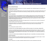
This is a design that I completed while working for NaTa2 Productions. The client, Kronus Entertainment, is a film production company specializing in underwater video shooting. At the time, they were working on breaking an underwater world record as a fund-raiser. The goal was to make a 100-mile trip around an island which would be approximately 24 hours underwater; the money raised was used to assist ill children. Kronus had a variety of extremely powerful equipment and talented personnel. They came to us needing a professional website to portray their image and draw more attention to their cause and company.

3G Screen Saver

Screenshot of 3G Screen Saver
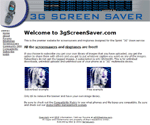
3g Screen Saver is a website that Harper Reed hired me to design. The site's purpose was to host screensavers and ringtones for early 2000s Sprint phones. Harper wanted a design with blue and silver colors, a picture of a sprint phone, and an area for banner ads. The rest of the site was to be very lite. The finished product turned out nice and the site became a huge success for Harper.

Lujack's SUV Trails

Screenshot of Lujack's SUV Trails
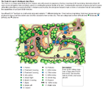
I designed this site for Lujack's Northpark Auto Plaza, where I previously held my internship. Lujack's is the fist dealership in the country to have their own SUV offroad test track. This track has several obstacles to test the performance of sport utility vehicles. The screenshot shown is a portion of the virtual map I built for Lujack's. When a user hovered their mouse over an obstacle a description of that obstacle was shown in the description box. If an obstacle was clicked on, a small video clip would be played in Quicktime format.

Lujack Intranet

Screenshot of Lujack Intranet
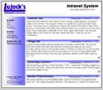
I held an internship at Lujack's Northpark Auto Plaza for the month of September 2002. During this month one of my projects was to build an intranet system to allow administrators to post news and happenings within the plaza. The site uses a PHP/MySQL back-end to submit news, and also to display uploaded articles. Since the people who will be administering the site don't know much about web design, I made this site as simple and fool proof as possible. They used the intranet system for quite some time and it proved to be very helpful for relaying information throughout the plaza.

The Simple Truth @ Cornell College

This is one of the many sites I built while on the Cornell College student webteam. It is probably my favorite due to the tight deadline and how well everything worked out. First of all, I had a 4-day deadline on this project. Cornell introduced a new marketing scheme to give students information about the college, which was titled "The Simple Truth." The college had hundreds of pamphlets printed out, which they would send to everyone who visited truth.cornellcollege.edu. On top of that we even had an advertisement going into U.S. News, which had a link to the site I was supposed to build (hence the short deadline). The site was only to be 1 page long, had to open in a static sized window, and needed to have a PHP based form to collect data and insert information into a database. On top of all of that, they wanted flash animation for the header. The screenshot pictured is simply of the flash animation.

Spanish Flashcards

Screenshot of Spanish Flashcards
I made this web application for a computer science class at Cornell. One of the projects suggested by our syllabus was a flashcard program written in the language of our choice. I chose PHP/MySQL in a heartbeat. The program allowed users to choose whether they wanted to test their vocabulary from English to Spanish or from Spanish to English. I wrote functionality that retrieves a random word from the database every time they choose a new card. Once a card is selected it is cached and marked as 'viewed'. This would make sure the program goes through every card before it repeats one of the previous ones. It was also designed so the user could choose which type of words they wanted to learn. They could select from adjectives, nouns, verbs, or all at once.

Broox Extreme

Screenshot of Broox Extreme
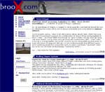
Broox Extreme was the former version of SolidGrind.com. It was an extreme sports website that included 6 categories: bmx, inline, scooter, skateboard, snowboard, and soap shoes. Each section had the latest news and information along with user submitted photos and videos. I hired several authors who specialized in at least one category of the site to help me keep everyone informed of what's going on. Almost a year after the site was released (October 2001), broox.com received over 700,000 hits and had nearly 700 registered users. Upon closing, the site was just shy of 1 million hits. YM (Your Magazine) found this site and contacted me in order to feature me and some of my "Soaping Buddies." They flew out from New York to do a day long photoshoot of us sliding on handrails, and we were all featured in the April, 2002 of YM magazine!

BrooksFSW

Screenshot of BrooksFSW
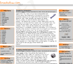
BrooksFSW was a site dedicated to Soap Shoes, a company that makes shoes capable of sliding across objects such as handrails, benches, etc. The activity of "soaping" is very similar to grinding with inline skates or skateboards. I did promotional work for Soap Shoes for several years and this site was a huge part of that. BrooksFSW was a portal site using PHP Nuke to develop a community for "Soapers." It kept users informed on the latest news and happenings with the company. It also kept everyone involved in friendly competition with photos, polls, forums, and videos. This was the first site I ran that used an extensive PHP and MySQL back-end and was an excellent learning experience for me. My mentor, Harper Reed, helped tremendously with the initial setup and training. It was released in September 2000 and integrated into Broox Extreme in October 2001. During that year it received nearly 620,000 hits and had 800 registered users. The site also had 441 news articles published and over 6,000 comments on those articles. BrooksFSW received some great recognition from large medias such as the British Broadcasting Corporation, The Mount Vernon Sun, The Rock Island Dispatch, and the Cedar Rapids Gazette. Disclaimer: After the BrooksFSW.com domain was released from my posession, another company purchased it. It has been known to display various lewd content. I have no affiliation with the current owner of the website.

PAAC

Screenshot of PAAC
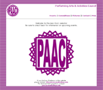
PAAC (Performing Arts and Activities Council) is an organization at Cornell College that organized all entertainment on campus. I was hired as a technician and web master for the 2001-2002 school year. As technician, I was in charge of setting up and running all audio/video equipment at our events. As web master, I had complete reign over the site. When I first joined this group the site was programmed via Macromedia Dream Weaver and was quite simple. I rebuilt the site from scratch, giving it a more uniform, professional look that was very easy to navigate. I also integrated some Flash animation for aesthetics. The color scheme may not have been the best, but it was our school colors and the overall layout turned out nice.

Computing Services

Screenshot of Computing Services
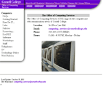
While at Cornell, I worked for Computing Services - the department that managed all of Information Technology. As part of my work-study I was hired to design a site for our department. It was my first experience in coding websites with things other than straight HTML, CSS, and JavaScript. I got to learn perl and the magic of including reusable .nav files for easy, DRY navigation manipulation. My main duty was to fix old links, remove unwanted content, add new content, and update various items throughout. Due to such a large amount of changes, I ended up recoding most of the site from scratch. Everything except for the RESnet (student intranet) section of the website was my work. At the time, if you saw a little stylized "x" in the footer the bottom of the page - I programmed it.

Advantage Group

Screenshot of Advantage Group
The Advantage Group is an investment company based in Cedar Rapids Iowa. They were a client for one of my employers and hired me to do their website. This site was fairly simple but needed to be extremely clean, professional, and still be able to relay a large amount of information to the reader. The site turned out just as planned and served as a great tool for The Advantage Group.

Kappa Theta

Screenshot of Kappa Theta
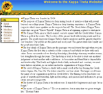
Kappa Theta is a female social group at Cornell College - Cornell's equivalent to a Sorority. The women of Kappa Theta hired me to design a simple informational website. After designing the site, I trained one of the women to update the content via Macromedia Dream Weaver. It turned out to be a very useful tool to easily communicate the message, purpose, and goals of the group. 5 years later, I ended up marrying one of them!