The Portfolio of Derek Brooks

E-Commerce

I've built plenty of sites that have handled some form of online payment - whether it's for goods, subscriptions, or events. The payment gateways I've used are Authorize.net, Braintree, Stripe, PayPal (including Paypal's Website Payments Pro and Payflow Pro)

Here are 11 projects that I've worked on tagged E-Commerce.

Venmo Purchase Protection
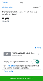
Screenshot of Venmo Purchase Protection
Purchase Protection provided a simple toggle button for Venmo consumers to specify whether or not they're paying for goods or services while sending a payment. When a payment is sent for goods and services, the seller would be charged a small fee and the payment would automatically be covered under Venmo's Purchase Protection Program. If something went awry with the transaction, both the buyer and seller could be covered and reimbursed. I was the lead architect for this feature and designed the APIs, data storage and fee collection solutions.

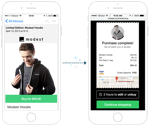
Modest Control Panel

Screenshot of Modest Control Panel
The Modest Control Panel was a multi-tenant Content Management System that allowed merchants to manage their Modest powered storefronts. Features included the management of store themes, payment gateways, shipping methods, orders, third party e-commerce product syncing, and even generating standalone iOS applications. The back-end of this app was built in Python using the Flask framework. The front-end was initially built with plain Javascript and jQuery, but was eventually migrated to React. As the Modest client application tech lead, I oversaw and greatly contributed to the overall product architecture and implementation of this web application.

Modest Commerce API

The Commerce API was a flask-based python API built to power storefronts for merchants using the Modest platform. I helped design and develop the initial architecture - including database modeling and endpoint design. As our company grew, I became the API consumer tech lead, so my API contributions switched primarily to endpoint contract collaboration.

Modest Web Store

Screenshot of Modest Web Store
The Modest Web Store was a mobile-first, responsive, multi-tenant web application that powered each of our merchant's web-based storefronts. In addition to (and more importantly than) a browsable store, it powered contextual buy buttons and instant checkout screens that could be embedded into ads, emails, and anywhere else on the web or in a mobile application. The client-side of the web store was initially built in Backbone.js and integrated with the Modest Commerce API via a thin Node.js proxy. Later, we started to migrate the front-end to Vue.js. I was the architect, tech lead, and leading contributor to the web client.

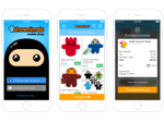
Modest iOS Store

Screenshot of Modest iOS Store
The Modest iOS Store was a multi-tenant, white label application that our merchants could easily adopt as a standalone app or as an SDK that could attach a storefront to their existing iOS app. When Modest was still young, and was "all-hands-on-deck," I got to do a bit of iOS development consuming the Modest APIs and rendering UIs.

TowRate

Screenshot of TowRate
TowRate was a startup that offered a custom service to towing companies. The site allowed subscribed companies to manage their assets, map routes, and calculate profit margins for every tow. It was built in a way that allowed the towing companies to quickly run these calculations while on the phone, so they could figure out the most profitable way to charge for each tow. On this project, I was in charge of pretty much everything except for the initial design. My job involved data modeling, loads of calculations, back-end development, front-end development, form design, and deployment. TowRate was a very javascript heavy application, using plenty of asynchronous calls for things like sorting, calculating rates on the fly, and grabbing map data from the Google Maps API. The Maps API was used to help determine mileage and time for each tow. From there, the app used extensive math and formulas to help find the best price for each call. Companies were able subscribe to TowRate on a monthly or yearly basis. I integrated PayPal's Web Payments Pro to handle these subscriptions; let users join, autorenew, enter discount codes, cancel accounts, etc. Subscribed companies could also manage their trucks (as well as truck expenses), users, tow rates, tax areas, routes, etc. It provided an all around fleet management solution to any towing company.

Michael Annett

Screenshot of Michael Annett
Michael Annett was an upcoming race car driver from Des Moines, IA. We didn't build his site from scratch, but when his site development/hosting company stopped providing good service, we were asked to take over. The former host of michaelannett.com was not very cooperative in the site transition - so we had an interesting time getting Michael's content for him. To get Michael's site, we wrote an internal app called Site Spider to crawl his existing site, save all the pages, their images, stylesheets, javascripts, etc - all while preserving the links and folder structure. Once I successfully crawled and downloaded this site, I put this app into our internal Content Management application, SiteMan. I also built a couple custom SiteMan plugins, which included a photo gallery and online store management. The store they wanted was fairly small, however, no matter the size, building an online store is quite an effort. After launch, Michael was able to easily update news, photo galleries, results, schedules, general web page content at anytime, and could sell his gear online.

NAPA Sales Driver

Screenshot of NAPA Sales Driver
Edwards Graphics Arts (a partner to NAPA) hired our company to build a web application for distributing posters and flyers to NAPA's retail stores. Each store could purchase any of several different promotional products. This is a process that NAPA and it's 3rd party designers had previously handled over the phone. I built a web application to help streamline this process and eliminate phone ordering. This app allowed Edwards Graphic Arts to upload and edit designs for the stores to order. Retail store managers could then visit the site and order promotional products that fit their demographic. This site was very javascript heavy with a lot of asynchronous calls to provide a quick user experience. I also integrated it with PayPal's Pay Flow Pro to allow for online payment.

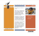
Trek For Kids

Screenshot of Trek For Kids
Trek For Kids was a fundraising bike ride for The Boys and Girls Club of Dane County. Their website provided information about the ride, allowed people register to ride, and also let people make pledges to the registered rider. A friend of mine contacted me to contract out the development for small section of this site. Shortly after, my partner and I were hired to design and program the rider registration, pledge donations, and full administration/reporting tools. This was our first time diving into accepting credit card payments, but we were able to get the registration and donation sections up and running on a secure server and used encryption in order to ensure protection for the visitors. The administration panel let Trek For Kids manage users, teams, donations, etc. It also provided full reporting to keep them up to date on number of registered riders, team rosters, and pledge standings.

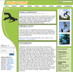
Solid Grind

Screenshot of Solid Grind
SolidGrind is a personal project that I developed as an extreme sports / soap shoes promotional and community website. It's the predecessor of my former Broox Extreme (www.broox.com) and BrooksFSW community sites. After I came up with the name and domain, I decided that rather than customizing a prebuilt system, I wanted to build this site from scratch. Developing the entire site myself was another great learning experience and paid off numerous times; I had full control and a great understanding of the system, so I could easily add on, fix bugs, and rebuild sections. One of the more fun parts of SolidGrind was the "feature pic" system. It allowed users to upload photos to be reviewed by the administrators that I'd hired. The uploaded photos were queued in a database and could be viewed/approved by administrators. Upon approval, the website would automatically size/scale the image, add a SolidGrind.com watermark to it, create a thumbnail, store it in the database, and feature the picture on the homepage until a new photo was chosen. In addition, I designed it so that each picture had to be featured for at least 24 hours; this gave everyone a fair amount of time on our front page. Besides photos, the site featured news, forums, tutorials, videos, and several other things related to extreme sports.

v2 - latest version

In 2006, I re-released Solid Grind to get away from publishing broader extreme sports content and focus on the grind shoe scene. There were so many other extreme sports sites with a full staff dedicated to maintaining them, but no one had this thorough of a website dedicated to the grind shoe scene. I worked with Nicole Sutherland on the design of this version, which turned out great for the content being delivered. The new version of the site was much more complete, the code was much more efficient, and photo manipulation was handled much better. With the initial version of SolidGrind I was very proud of the photo management system - this system was much cleaner and much more versatile in that most image manipulation was handled on the fly.

Wireless Wallpapers

Screenshot of Wireless Wallpapers
Wireless Wallpapers was a personal project of mine. It was a site that allowed users to download wallpapers for their early 2000s color screened mobile phones. At the time there were several sites offering this service however nearly all of them only supported one type of phone or charged money for each wallpaper downloaded (usually $1.00 per wallpaper). Wireless Wallpapers allowed users to download unlimited wallpapers for free, which were available for several types of phones. The free wallpapers had a tiny "wirelesswallpapers" watermarks near the bottom of the image, however if the user paid a small fee each month, they could get more features (such as private wallpapers) and the watermark was removed. In addition to this, I added functionality to allow users to upload their own images to the website which gave me the ability to let the site run itself. The website automatically resized the uploaded user images to fit various mobile screen sizes and printed my watermark to the image. The site was a huge success and learning experience. The first day it was online it received 7,000 hits and had nearly 100 users. After the first week there were nearly 50,000 hits and 500 users. Upon selling the site, I had over 24,000 users and received over 3,200,000 hits.