The Portfolio of Derek Brooks

CSS

Front-end styling isn't my expertise, but I've become quite proficient in cross-browser and responsive styling over my years of web development. I've built applications with Sass, less, raw CSS, and various other styling frameworks.

Here are 37 projects that I've worked on tagged CSS.

Galactic Crypto Card

Galactic was a startup that was developing a product that would allow workers who were paid in cryptocurrency to easily spend their earnings via a debit card that linked to their wallet. I contracted with them to mentor/pair program with new frontend developers on building out the new user registration flows and account management pieces of the product. The company was unfortunately shut down before the product was launched.

derek.broox.com

Screenshot of derek.broox.com
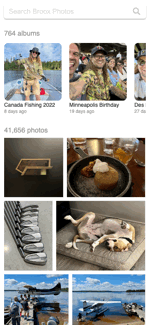
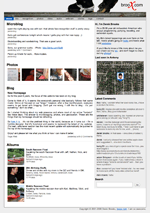
derek.broox.com is my general home page, online scrapbook, and development playground. Its primary purpose is to catalog my life and allow me to play with various APIs and web development technologies. It serves up thousands of photos, check-ins, microblogs, blogs, maps, videos, and various other data from my life. Since 2001, it has been a constantly evolving web application.

v8 - latest version

This is the first version of my site that I completely rebuilt in a new language and platform. I moved the entire site from a containerized LAMP stack to a server-side-rendered (SSR) Nuxt.js application that relies completely on the Broox API to power its content. I chose Nuxt and SSR in order to keep my SEO and open graph / social sharing meta tags intact while still providing a speedy, asynchronous client-side browsing experience.

Modest Control Panel

Screenshot of Modest Control Panel
The Modest Control Panel was a multi-tenant Content Management System that allowed merchants to manage their Modest powered storefronts. Features included the management of store themes, payment gateways, shipping methods, orders, third party e-commerce product syncing, and even generating standalone iOS applications. The back-end of this app was built in Python using the Flask framework. The front-end was initially built with plain Javascript and jQuery, but was eventually migrated to React. As the Modest client application tech lead, I oversaw and greatly contributed to the overall product architecture and implementation of this web application.

Modest Web Store

Screenshot of Modest Web Store
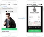
The Modest Web Store was a mobile-first, responsive, multi-tenant web application that powered each of our merchant's web-based storefronts. In addition to (and more importantly than) a browsable store, it powered contextual buy buttons and instant checkout screens that could be embedded into ads, emails, and anywhere else on the web or in a mobile application. The client-side of the web store was initially built in Backbone.js and integrated with the Modest Commerce API via a thin Node.js proxy. Later, we started to migrate the front-end to Vue.js. I was the architect, tech lead, and leading contributor to the web client.

Simple Auto Service

Screenshot of Simple Auto Service
In the early 2000s, I often found myself at a mechanic or auto-parts store needing to know the last time I performed a certain service on my vehicles. So I whipped up a tiny web-app to help track and display this information. A decade later I became bored while traveling, so I decided to clean up the old app and publish the code. It's a super simple PHP/MySQL CRUD application based off of an ORM and Model framework that I built after learning Rails in 2008. The app itself barely has any features but I published the code publicly to show some friends my simple PHP framework. Today, I'd just use a damned google docs spreadsheet to track this stuff.

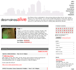
Des Moines Alive

Screenshot of Des Moines Alive
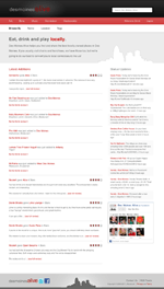
Des Moines Alive is a personal project that my friend Nick Leeper and I built to help Des Moines Area folks find awesome local bars and restaurants. In addition to general merchant info, we provided users with aggregated data such as reviews, foursquare tips, merchant tweets, etc. We designed Des Moines Alive to be very lite and easy to navigate. The goal was to provide our visitors with the information they wanted as quickly as possible.

v2 - latest version

Nick and I decided to use this version of Des Moines Alive to learn new things, play with APIs, and switch our focus to local businesses. We built our own custom PHP MVC, with ideas borrowed from our experiences with Rails and Kohana. We redesigned our database to be more efficient. We also began using many more APIs such as SimpleGeo, Google Maps, Facebook, Foursquare, and Twitter to aggregate data and give our users more information.

Dipity

Screenshot of Dipity
In short, Dipity was an interactive digital timeline web application with a hint of social networking. We built an incredible web-based tool that allowed users to create, share, embed and collaborate on interactive timelines that integrated video, audio, images, text, social media, geolocation and of course, accurate timestamps. Timeline viewers could pan around and zoom into these timelines for a very nice, visually engaging experience. Being that it was all built in vanilla javascript, it even worked, and was incredibly responsive, on mobile devices, ipads, etc.

v3 - latest version

Building Dipity 3 is the main reason I was hired. Version 2 was a couple years old. The design was dated, its timeline widget was built on the YUI library, and was generally inefficient. Dipity 3's goal was to update the look, improve the widget's efficiency, support HTML5 guidelines, function on mobile devices, and provide several new features. I built the front-end from the ground up, added several new features in both the front and back end (including Facebook connect, better registration process, etc), and worked closely with our other part-time engineer on the completely rewritten javascript timeline widget. I spent a lot of time making sure that the new Dipity timeline widget worked on mobile devices such as androids, iPhones, and iPads.

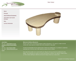
Smithson Woodworks

Screenshot of Smithson Woodworks
Smithson Woodworks is a side project that was run by my cousin-in-law, Jon Smithson. One year we decided to trade, he'd build me a component rack for my entertainment center, and I'd help him get his stuff online. Jon sent me a logo and some photos of his work, I helped him by setting up a Wordpress site that integrated with a Flickr account. Jon simply uploaded photos and created albums on Flickr and those would become automatically mirrored to the portfolio on SmithsonWoodworks.com.

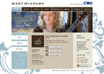
Mary McAdams

Screenshot of Mary McAdams
Mary McAdams is a Des Moines area folk artist who was becoming super well known in the area. Mary hired my friend Mindy Hoskin as her designer - and Mindy approached me to bring her designs to life. Having a small web budget and not a lot of time, I used this opportunity to brush up my WordPress skills. I was able to build Mindy's designs out into a WordPress template and still keep a lot of the custom functionality that Mary wanted. Along with her blog, Mary also wanted a lot of multimedia - photos, video, a music player, show times, downloads, etc. For photos, I was able to customize one of the many WordPress Flickr plugins to work with Mindy's design. Show times and the Music player were powered by Mary's ReverbNation account. To make show times work, I hooked her ReverbNation calendar RSS feed to FeedBurner BuzzBoost and embedded the generated BuzzBoost into her blog accordingly. Combined with Mary's active social networking, I think we were successful in getting all of her info in front of an audience in an elegant way.

Holiday eCards

Screenshot of Holiday eCards
This is a microsite that I built as a marketing tool for malls owned by PREIT. It allowed people to customize and send flash-based cards to friends and family. It was also built so that a campaign could be coupled with a contest. For example, all cards sent to moms on mothers day could be eligible for a mall gift card. For delivering the cards, I wrote a small script using the WhatCounts.com API. This little application was a lot of fun to work on and a huge success for the associated malls.

v2 - latest version

The Holiday eCard microsite was brought back to life for the winter holidays in 2009. Only this time instead of supporting only 3 malls, it was to support ~40 malls. That said, there were many performance improvements and generalizing of the codebase. The site was a great success receiving several hundred cards.

Countryside Motorsports

Screenshot of Countryside Motorsports
Countryside Motorsports is an interesting little site that I was able to crank out pretty quickly in 2008. However, we got it done right when our client got super busy, so it sat unlaunched for about a year until we were able to resurrect, update, and launch the site. It was a pretty basic marketing/inventory viewing site for an ATV, Snowmobile dealer in Iowa. I modeled and built a custom admin for managing inventory, specials, and homepage banners.

Michael Annett

Screenshot of Michael Annett
Michael Annett was an upcoming race car driver from Des Moines, IA. We didn't build his site from scratch, but when his site development/hosting company stopped providing good service, we were asked to take over. The former host of michaelannett.com was not very cooperative in the site transition - so we had an interesting time getting Michael's content for him. To get Michael's site, we wrote an internal app called Site Spider to crawl his existing site, save all the pages, their images, stylesheets, javascripts, etc - all while preserving the links and folder structure. Once I successfully crawled and downloaded this site, I put this app into our internal Content Management application, SiteMan. I also built a couple custom SiteMan plugins, which included a photo gallery and online store management. The store they wanted was fairly small, however, no matter the size, building an online store is quite an effort. After launch, Michael was able to easily update news, photo galleries, results, schedules, general web page content at anytime, and could sell his gear online.

S & C Automotive

Screenshot of S & C Automotive
S & C Automotive is a company that provides vehicle warranties and protections to local car dealerships. If you bought a car from any of several dealerships in Iowa, you'd be offered a set of warranties - paint protection, rust protection, etc. These protections were all sold to the dealerships by S & C. I built a web application to allow S & C to manage these protections and offer them to dealerships. The dealerships had their own accounts and could log in and select each protection that they sell. Then, S & C could view, process, ship, and bill for these registrations.

SiteMan

Screenshot of SiteMan
SiteMan is a Content Management System that we built at Red 5 Interactive. It was originally built so that mall property owners could manage each of their mall property's websites. However, once we realized how powerful our system was, we decided to generalize the app so that we could deploy it for all of our clients. We rebuilt SiteMan to allow our clients to easily manage a single website or a group of websites. This way, a parent company could edit any of their child company websites, while employees of the child companies would only be able to see and manage their respective site. The front-ends of the sites managed by SiteMan were also completely extracted from SiteMan itself, which was great for 2 reasons. First of all, it allowed us to more easily keep all of our clients' systems up-to-date in that we were just updating SiteMan and not touching their presentation layer. Secondly, it also allowed us to launch new campaigns and designs for clients very quickly without touching the content management system. When we deployed SiteMan for a client it came with a core group of tools like user management, web page editing, file management, audit logs, etc. From there, custom tools could be added as plugins. These tools included functionality like, announcements, events, careers, photo galleries, stores, social networking, etc. We also built SiteMan in a way that allowed users to customize their tool layout. Any user could pick which tools they used the most and arrange them in a way to get a quick snapshot of the exact data that they were interested in. Tools could be added, removed, or sorted at any time - and everything remained just as they left it on their next visit. This application was very Javascript heavy, making extensive use AJAX, dialog windows, and WYSIWYG editing. As such, we had minimal page loads which provided a very streamlined experience for our clients. I am very proud and excited to have worked with such a great team on this app. It was so versatile and simple to keep pushing forward.

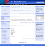
Des Moines Broomball

Screenshot of Des Moines Broomball
I am a broomball player. Broomball is a sport similar to hockey but a bit more recreational. Once my Broomball league caught wind of me being a well-connected, tech savvy guy, they nominated me to be the Marketing Director. As marketing director my main purpose was to help promote the league - and what better way to do that than to build a fancy website. Not having hardly any time to devote to this project, I decided to try out a product that I'd heard a bit about, called Drupal. The Drupal Content Management System was a pretty great little app. I literally had a community site up and running within an hour. The Drupal community had written so many modules, that I didn't have to write a single line of code to get the site off the ground. After installing a handful of modules, a bit of layout tweaking, and modifying a tiny bit of PHP, we had a completely functional site. I even got the help of designer Kathryn Downing to whip up that logo in a matter of about 25 minutes. I wouldn't use Drupal for everything, but it was definitely an excellent solution for this project. The site helped the league gain players and teams for our regional tournaments.

Signs Plus

Screenshot of Signs Plus
Signs Plus is a Des Moines area company who is responsible for some of Iowa's most impressive signage. They hired my company, Red 5 Interactive, to completely rebuild and rebrand their site. They wanted something that was loud, colorful, and gets their products right in front of the customer. Our designer took care of the visual aspects, while I was in charge of modeling and content management. The major function of the admin panel was to allow Signs Plus to upload photos of their work. The images were dynamically resized in several ways to fit the flash-based home page, as the rest of the site. Being that the homepage was flash, I also built some dynamic XML endpoints to feed data to power the animations. Shortly after release, we received emails from Signs Plus saying that they were already getting new business based on the quality of their site.

iTunes Web Remote

Screenshot of iTunes Web Remote
In 2008, I bought a couple Airport Express modules to create an iTunes controlled whole-house-stereo. It was awesome until a terrible song would come on and I'd have to run upstairs to skip to a better tune. Apple quickly became aware of this problem and released an iTunes remote for iOS. However, at the time I didn't have any iOS devices and I couldn't justify spending a few hundred dollars for an ipod touch/iphone music remote. As such, I decided to build a remote of my own. Using PHP and AppleScript to communicate to iTunes, I was able to whip up a super light web-based remote that ran on my Mac. With "LAMP" running locally, I could visit the IP of my Mac from any device on my internal network and navigate my songs. At the time, I used this to switch songs via my blackberry, sidekick, a PSP, or even our Nintendo Wii. It was great for parties!

Justin Marks Racing

Screenshot of Justin Marks Racing
The company I work for, Red 5 Interactive was hired to build a site for NASCAR truck driver, Justin Marks. Our basic guideline from the driver was to "make it like Bam Margera's site." He really enjoyed moving elements, photos, and of course - a music player. My job was to integrate the site with Justin Marks' Flickr account, build XML feeds to power our flash app, and also build a non-flash version of the site.

Team 46

Screenshot of Team 46
Team 46 is a group of service and avionics specialists working at the Des Moines Flying Service (DMFS). They hired our company, Red 5 Interactive, to make a micro-site for their technicians. The Team 46 micro site was pretty straight forward. They needed a way to blog, manage case studies, take service requests, and upload photos. For the blog, I simply installed an internal blog plugin that I'd previously built. Everything else in the CMS was custom programmed. There was nothing crazy about this app, but everything was built and deployed very smoothly.

The Bellevue

Screenshot of The Bellevue
The Bellevue is a building located in downtown Philadelphia that houses restaurants, shops, and a hotel. They hired my company, Red 5 Interactive to build an informational site for them. I built a small, custom content management system for this site allowing Bellevue to manage events and photo galleries. The photo galleries could be organized and sorted via drag and drop.

Countryside RV

Screenshot of Countryside RV
Countryside RV was my first complete Ruby on Rails site. I was the main programmer for this project while working with Red 5 Interactive. Our designer and front end developer took care of most of the design and html build-out. I was in charge of modeling and building the actual application and content management system. The primary function of the site was to display all of Countryside's current RV inventory. Countryside could add a large amount of detail as well as upload multiple photos of a given RV. We've also implemented a "Buyers Gallery" that allowed some visible interaction with Countryside's user base. When someone bought an RV from Countryside, they'd be featured on the website with their new camper.

Five Point Studios

Screenshot of Five Point Studios
Five point studios was a professional piercing and custom tattoo shop in Johnston, IA. I was hired to revamp their severely outdated website and built them a custom content management so the shop could manage any page as well as manage staff members and portfolios. I incorporated one of the shop's tattoo sketches into the design along with a fancy font that they requested. As with any website, if the visitors don't have that font installed, they won't see your fancy text. So, using PHP's GD library, I wrote functionality to dynamically load their font and create fancy title images on the fly. The site was much more successful in allowing Five Point to showcase the incredible work that consistently came out of their shop.

515 Alive

Screenshot of 515 Alive
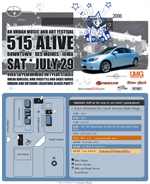
515 Alive is an urban music festival that takes place in Des Moines, IA. We donated this simple dynamic informational site to relay event times and locations. The site's simplicity was largely due to the very short deadline and last minute event changes. I worked closely with a local designer for some of the elements.

Aeon Grey

Screenshot of Aeon Grey
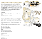
I built this site for Aeon Grey, a Des Moines hip hop artist, to promote both himself and his 5th solo album: Primate Curriculum. Aeon Grey wanted a very lite site that would include a forum and also allow him to publish photos, videos, and mp3s. The site's news was integrated with the forum to allow Aeon to display important updates on both, the forum and the home page. I worked graphic designer, Mindy Hoskin, for the graphic elements, which are taken primarily from the album art that she designed. I also did some of Aeon Grey's photography and videography.

Rebels Advocate

Screenshot of Rebels Advocate
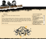
Rebels Advocate was a Midwest Hip Hop group that got together in Iowa City. With their gaining popularity they decided they needed a strong web presence to show the world what they were all about. Rebels Advocate was referred to my partnership needing both a website and a music video. With a very limited budget, we had to cut a lot of corners, but the results of both the video and the website turned on great. The site allowed visitors to check out their bios, video, photos, and most importantly, their music. We also installed a community driven forum to keep visitors coming back to the site and gave them analytics to track the site's traffic.

Iowa Business Alliance

Screenshot of Iowa Business Alliance
Iowa Business Alliance came to my partnership with a design in place, but they needed help bringing their vision to life. We built them a useful, dynamic website with a custom content management system that they could use to attract potential clients.

Iowa Meth Watch

Screenshot of Iowa Meth Watch
Iowa Meth Watch (local partner of the national Meth Watch program) approached my partnership seeking a website similar to the larger organization's, but with more localized content. We recreated graphics, created and enhanced flash animations, cleaned up code, and added new content to help integrate the state of Iowa into the Meth Watch program.

Falaphilia

Screenshot of Falaphilia
On October 14th 2004, Bill O'Reilly from Fox News was threatened with a sexual harassment lawsuit. A typo was made on the lawsuit transcript, where instead of "loufa," the officer wrote "falafel." Some friends and I found this hilarious, so we coined the term "Falaphilia" and put this website together. Even though it was just a joke. We ended up having approximately 50,000 visitors in the first 48hrs and peaked at 100,000 visitors in the first week. We then switched it up and served large political content to the blogger demograph and pulled 3.7 terabytes of transfer in 5 days. I handled the design of this site as well as some creative content, and made a graphic of O'reilly hugging a giant piece of falafel.

Learn To Yo-Yo

Screenshot of Learn To Yo-Yo
Learn to Yo-Yo was a site dedicated to teaching kids new yo-yo tricks. Pro yo-yoers would update the site with videos and tutorials. My job in this project was to simply come up with a lite front end design, which you can see displayed here.

We Own The Sun

Screenshot of We Own The Sun
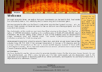
One day, a couple friends and I decided to claim the sun. As such, we quickly designed this website to let the world know that "we own the sun." The site we created sold plots of the sun as real estate and donated part of the profits to cancer research. I was in charge of the site's design and some of the creative content.

The Jugglers

Screenshot of The Jugglers
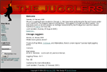
Three years after the original site had gone live Harper Reed hired me to do a redesign. The new site was basically a blog running movable type to update Jugglers in the Chicago area about upcoming events.

James H. Laas Company

Screenshot of James H. Laas Company
I developed this site for the James Laas Company out of Bettendorf, Iowa. At the time, it was one of the largest, most complex, and complete systems that I'd built. Prior to my development, they made all of their updates by updating static HTML files - a content management system was very much needed. They had a huge amount of content and product information that became quite redundant in the way that they were displaying it. I designed a more aesthetically pleasing site powered by a PHP/MySQL back-end. With the new design, I concentrated mostly on the ease of navigation and finding vital information quickly, which was successfully attained. Their site became completely free of managing and uploading static files and was updateable via the CMS that I created. The database proved to be very useful as the James Laas company wrote several articles per month. This site was also the home of the first site wide search engines that I'd built. Jhlaas.com was a huge success and a great learning experience.

Kronus Films

Screenshot of Kronus Films
This is a design that I completed while working for NaTa2 Productions. The client, Kronus Entertainment, is a film production company specializing in underwater video shooting. At the time, they were working on breaking an underwater world record as a fund-raiser. The goal was to make a 100-mile trip around an island which would be approximately 24 hours underwater; the money raised was used to assist ill children. Kronus had a variety of extremely powerful equipment and talented personnel. They came to us needing a professional website to portray their image and draw more attention to their cause and company.

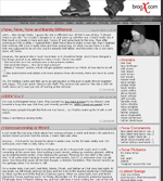
Broox Extreme

Screenshot of Broox Extreme
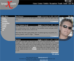
Broox Extreme was the former version of SolidGrind.com. It was an extreme sports website that included 6 categories: bmx, inline, scooter, skateboard, snowboard, and soap shoes. Each section had the latest news and information along with user submitted photos and videos. I hired several authors who specialized in at least one category of the site to help me keep everyone informed of what's going on. Almost a year after the site was released (October 2001), broox.com received over 700,000 hits and had nearly 700 registered users. Upon closing, the site was just shy of 1 million hits. YM (Your Magazine) found this site and contacted me in order to feature me and some of my "Soaping Buddies." They flew out from New York to do a day long photoshoot of us sliding on handrails, and we were all featured in the April, 2002 of YM magazine!

PAAC

Screenshot of PAAC
PAAC (Performing Arts and Activities Council) is an organization at Cornell College that organized all entertainment on campus. I was hired as a technician and web master for the 2001-2002 school year. As technician, I was in charge of setting up and running all audio/video equipment at our events. As web master, I had complete reign over the site. When I first joined this group the site was programmed via Macromedia Dream Weaver and was quite simple. I rebuilt the site from scratch, giving it a more uniform, professional look that was very easy to navigate. I also integrated some Flash animation for aesthetics. The color scheme may not have been the best, but it was our school colors and the overall layout turned out nice.

Computing Services

Screenshot of Computing Services
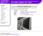
While at Cornell, I worked for Computing Services - the department that managed all of Information Technology. As part of my work-study I was hired to design a site for our department. It was my first experience in coding websites with things other than straight HTML, CSS, and JavaScript. I got to learn perl and the magic of including reusable .nav files for easy, DRY navigation manipulation. My main duty was to fix old links, remove unwanted content, add new content, and update various items throughout. Due to such a large amount of changes, I ended up recoding most of the site from scratch. Everything except for the RESnet (student intranet) section of the website was my work. At the time, if you saw a little stylized "x" in the footer the bottom of the page - I programmed it.